Surfing the web I found the following existing F-II models :

the Aviodrome's replica

the apparantly freeflight indoor model of J.W.Roest

Glen Fortuin's model

the freeflight model of Ingmar Knif

and of course the R/C Fokker of ???
But no cardboard at all.
Though photographic material was not that poor, it was not an amount to be happy about.
No coloured ones anyhow.
The following dimensions were found :
https://alchetron.com/Fokker-F.II
Length: 11.65 m (38 ft 3 in)
Wingspan: 16.10 m (52 ft 10 in)
Height: 3.66 m (12 ft 0 in)
https://en.wikipedia.org/wiki/Fokker_F.II
Length: 11.65 m (38 ft 3 in)
Wingspan: 16.10 m (52 ft 10 in)
Height: 3.66 m (12 ft 0 in)
http://www.aviastar.org/air/holland/fokker_f-2.php
Wingspan 16.1 m 53 ft 10 in
Length 11.65 m 38 ft 3 in
Height 3.2 m 11 ft 6 in
http://www.dutch-aviation.nl/index5/Civil/index5-2%20F2.html
Wingspan 17,6 m
Lenght 10,3 m
Height 3.7 m
I just contacted Paul van Weezenpoel via FB about this pen-slipper.
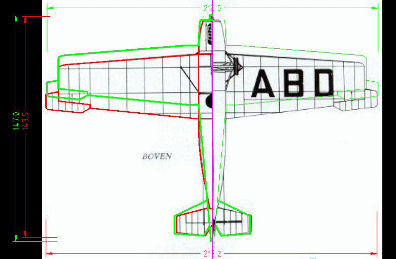
I found only two 3D views and one (free flight model) drawing:


Curious to see which one is the closest to reality.

or the span is 13mm too long, either the length is 8mm too short

the screendump of J.H.Bosman's indoor free flight model drawing show better proportions


prototype, final version and 3view compared

comparison of photo's and 3views ther ailerons seem to be quite small...

Only the aileron of the Soesterberg F2 - the one under the ABD 3view section -
fits with the traced 3view-shape. Since that picture is the only F2 prototype
the conclusion that the later ailerons were wider than the originals seems to be justified.
A good reason to compare the 3view of Dutch-Aviation with J.H. Bosman's.
Quite such a difference, not visible at first glance.
The stabilizer could very well have been enlarged for a free-flight improvement.
I do hope to find it out by photographic comparison.

stabilizer problem solved
Remains the discrepancy of the red and green wing position

coïnciding the photo- and 3view wing roots (red lines) green is definitely wrong
Returning to the ailerons (photo collage) the following correction has to be applied :


so the fuselage of prototype and later is the same ?
I doubt . . . even the reg.character was changed ;-)


so let's stay with the original version

and its funny nose
Well, I suppose it's a start...

The 1920 KLM logo was captured from one of the Aviodrome's pictures and stretched to get rid of the photographical aberration. The shape of the badge as drawn on one of the 3views served as a guideline.

While working with pictures and raster graphics the 'coloring problem' could be tackled straight away.

Funny, by taking the arithmetic mean (4th value) of the three photo-RGB's the results looked quite acceptable.
Back to the drawing...

'In cauda venenum' : 'The sting is in the tail'.
Due to my professional idiosyncrasy (check, check, double-check) I laid three 3views one upon the others and . . .
Who's to say which one's okay ?
Well well, even in the darkest hour there's an old picture . . .

________________________________________________________________________________
The first time you think to send page2.pdf to the printer in order to start cutting the fuselage you hear the pilot asking 'where ?'....

Another difference between the later FII with its Armstrong Siddeley Puma engine and this V.45 (BMW) prototype was the windscreen. It had to be considderably resized behind the exhaust of the Puma clearly visible on the 1 : 1 model on display in the Aviodrome.

Looking carefully you'd see not only a difference in screens but more far reaching in the shape of the engine-compartments.

A minor correction on only one bulkhead with quite some surgical implications :

And then I think it's time to send her to the printer and open my toolbox.

 |
| in case someone likes to build from a 'screendumped' jpg - go ahead but don't moan about inaccuracies
In case you dumped already... here's the first misstep

the engine hood colours were still in the 'helpline-layer', the layer one normaly switches off prior to print
Then I rteceived a mail from Paperkosmonaut in which he explained how the printer translates the RGB-colours from the pdf's.
To be brief I found an on-line CMYK-conversion site that turned this page 2 into CMYK colours and indeed brighter/stronger than the pdf ones.
A disadvantage is the increased black of lines and text as well as the fact that the conversion is presented as a JPG file with the expected deformation effect (scale !) I saw long ago. The text-style is changed as well.
The image below are scans of the original PDF-print (left side: exact on scale) and a print of the to CMYK-converted pdf (right side: jpg file and visibly less high - 8mm).

Colours of both pictures are reasonably different from those on the A4's I put into the scanner.
To avoid the influence of again another colour-affecting device I used the camera in 'tulip-mode' ;-)

By the way, sending a PDF to the printer with the option to mainrain the primary CMYK values didn't sort out any effect.

As usual my blog cannot be complete without
the errors
The first surprise

too low or too high ?
How come ?

The lowest cyaan circle is taken from cross-section 4 of the 3view;
The smaller one indicates the length of the error, exactly the center hight of the wing spar.
It's again an example how easy a slip of the mouse can occur in digital drawing.
Well, then it's wing-time, but  Originally it was planned to build the wings apart from the fuselage but then the idea arose to integrate the wing-spar with bulkhead 4... 
...thus blocking the lower surface of the wings to slip over the fuselage roof, but only the area of the spar and its former (marked in red)
Hope this 19th error will definitely be the last one (in this case;-) :  
and it should have been something like . . .
 there she is  |